
Spirit of Lozen — Case Study
Lozen approached me at the very beginning of their journey — the idea existed only as a rough sketch and a loose vision for a sustainable clothing brand. My role was to turn that early concept into a living, breathing identity with a clear visual language and a strong sense of purpose.
With over a decade of experience positioning major retail brands, I developed Lozen’s aesthetic direction, visual identity and photographic style from the ground up. The goal was simple: create a brand that felt intentional, modern and aligned with its values, and communicate its DNA through confident, recognisable imagery.
What began as an idea on the back of a napkin became a cohesive brand world — with a defined mood, tone, identity and photographic direction that Lozen could build on as they launched their product line.

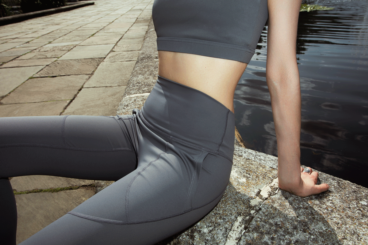
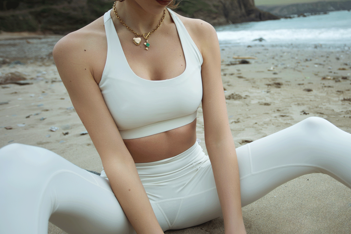
A selection of images created to position Lozen’s identity and
define the brand’s early visual language.


My Role
I acted as Lozen’s Brand Director and Photographer, responsible for shaping the entire visual identity of the brand. This included defining the aesthetic direction, building the brand world, and creating the photographic style that would become the backbone of Lozen’s communication.
My work covered:
Developing the brand’s visual language and identity
Creating moodboards and aesthetic references
Setting the tone, colour palette and overall look-and-feel
Directing the photography style, lighting and composition
Producing the first set of brand imagery to support launch
Ensuring consistency across all visual touchpoints
Translating the brand’s values into a clear, recognisable visual system
In short, I built Lozen’s visual foundation — turning an undeveloped idea into a cohesive identity that the brand could confidently present to the world.
Process
I took Lozen from a loose idea to a defined visual identity through a simple but structured creative process:
1. Define the brand DNA
Clarifying the values, mood and lifestyle the brand needed to express.
2. Build the visual world
Moodboards covering colour, texture, light, styling and overall aesthetic direction.
3. Set the aesthetic rules
Tone, palette, composition and lighting style — the core of Lozen’s identity.
4. Direct the imagery
Designing the photographic style and producing a concept shoot that captured the brand’s look and feel.
5. Deliver a cohesive identity
A consistent set of launch-ready images for web, social and product use.

Outcome
The result was a fully realised visual identity that transformed Lozen from a loose idea into a coherent, premium brand ready for market. The aesthetic direction, brand world and photographic style I developed gave Lozen:
A clear and recognisable visual identity
A cohesive set of launch-ready images for website, product pages and social media
A consistent aesthetic language that ties all brand touchpoints together
A stronger sense of purpose, mood and personality
A professional foundation they can build on as the brand grows
By defining the brand’s visual DNA early, Lozen gained clarity, direction and a polished identity that communicates its values with confidence. What started as an unfinished concept became a structured brand with a strong point of view — supported by modern, editorial-driven imagery designed to elevate perception and strengthen market presence

A selection of flat-lays created to establish Lozen’s visual identity.


Summary
This project transformed Lozen from an undeveloped concept into a structured brand world. I defined the visual identity, set the aesthetic tone and produced the first collection of images that now form the backbone of Lozen’s communication and presentation.
If you’re building a brand
If you’re developing a fashion label, product line or lifestyle brand and need a strong visual identity from the start, I help shape the aesthetic direction and produce the imagery needed to launch with confidence.